Visualisations
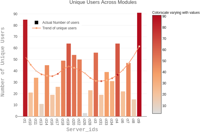
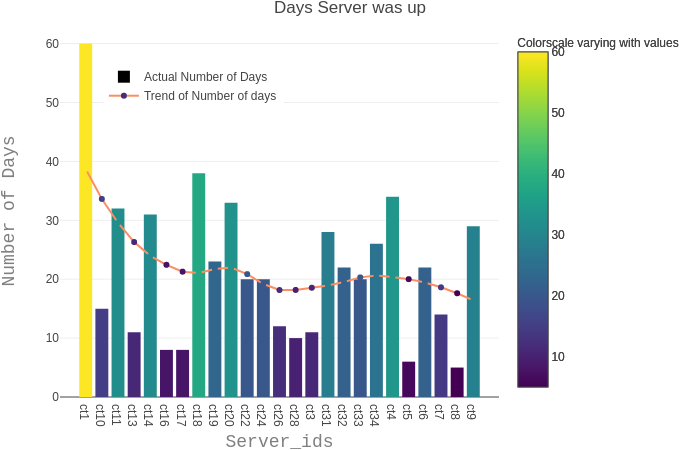
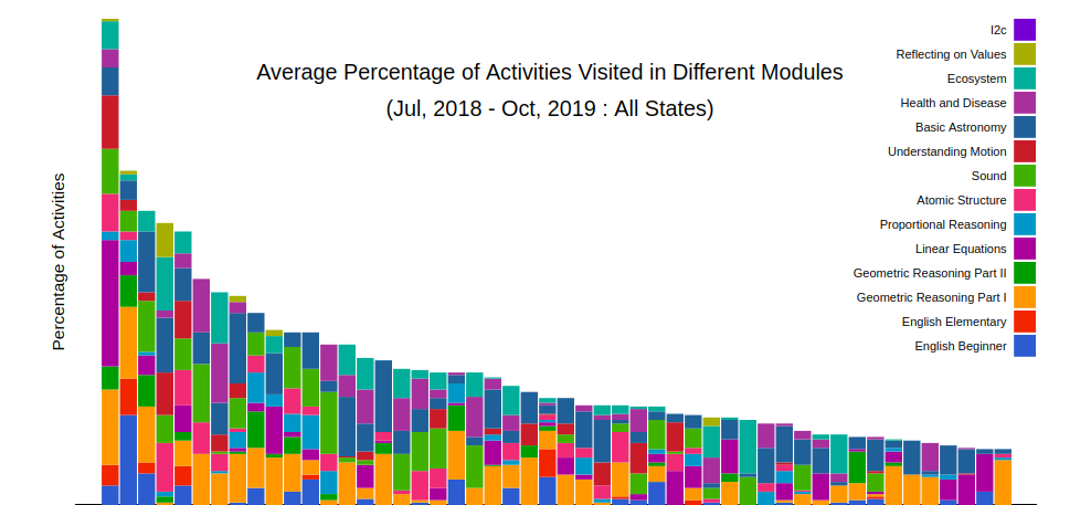
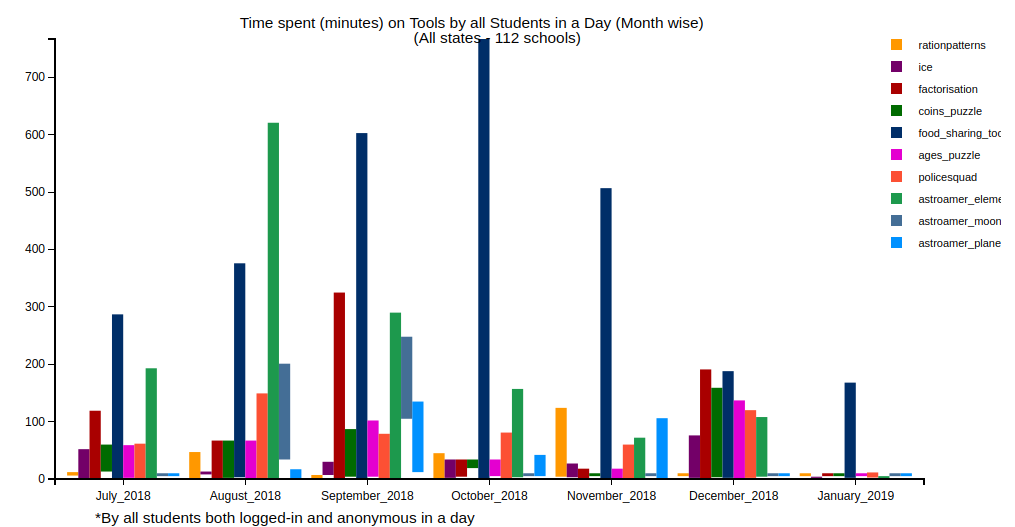
Visualisations are an excellent tool for exploring datasets, which are huge and have multiple dimensions and layers. They let people slice and dice complicated data across different dimensions based on individual's research question and get better visual insight of the data. This page contains various categories of visualisations, we could collate using CLIx platform data. These graphs are updated every month with syncthing data from schools.


